.png)
Workflow Portal Platform
The platform is a management portal system designed for office and administrative employees for a private construction corporation for a more secure access way to share, and submit information.
Role
UX Design
UI Design
Tools
Figma
Adobe Suite
Overview
Collaborated with our development team and stakeholders to understand and communicate to the employee users. From defining the functionality to creating wireframes, all the way to creating final UI design. I was responsible for leading the UX and UI across key parts of the application side of the platform.
The Problem
The portal software developers needed help in developing an intranet system for the company. The project had been in the ideation process started by the develop team, but the portal’s look and performance required major improvements. The team then turned to me to revise the overall portal’s design and develop new solutions to already existing problems.
Before conducting the research, I used the existing beta platform. The interface was created without any usability testing and had little consideration for the technical and product limitations on the scope of work. I conducted research interviews with our stakeholders to uncover any pain points regarding the platform.
I wanted to streamline the process to help people grow their productivity in their departments. The Goal was to improve the interface design and prioritize usability features. Applying design thinking strategies to the process means thinking from the users’ perspective as in how they will react to the web app.
-
Implemented a Design Process: A design process, structuring a plan of action to increase our visibility and design.
-
Conducting Research: Conducting a field study would help us understand users in feature exploration or demonstration of pain points in existing systems.
-
Improved usability across the platform: Finally, I begin the design portion of the project with sketches and wireframes, to the final experience.
-
Establishing a design system: Once I understood the pain points and desires of the user, I brainstormed solutions to the experience.

Discover
User Research: Prioritize Usability Features
Once I had the idea, it was time to understand the audience, which were our employees. I needed to think about the potential of the idea. Who will be using the web app; Managers, Supervisors, Directors, Leads? I had to consider the business and user problems of the app.
With over 800 employees in 36 departments, I would conduct a web-based survey, allowing users to interact with the computer and mobile to process survey questions. Building questionnaires and analyzing the qualitative and quantitative research results. The survey data was conducted to understand the business problems; while the comments were for users.


Prioritize
Key Findings
After collecting the data from the user surveys, I started to develop the survey results with my a to synthesis the results from each department. The results list for all departments were present to all managers to see and compare scores from last year. Factors that were determined: -Number of participants and their average -Level of engagement for each department Comment and concerns to the managers to draw concerns within the department
-
Utilizing New Tools Understanding the managers experiences in their line of product development.
-
Level of Engagement what the platform should focus on and why
-
Highlight Departments Issues Focusing if the manager is concerned about the employees issues.

Getting ready to present the data to the board and managers. Presenting the findings and open for more discussions


Designing the infographics to match the corporate brand.
Feature Considerations: Business & User Aspects
I needed to prioritize the solutions. To understand both sides of user and business goal, I listed usability features in order of priority. The framework helps to identify the severity score of a usability feature. To reduce the risk of making bad design decisions, I used the same divergent-convergent approach used to tackle the data collection and prioritization.

Wireframing & Protoyping
Mid-Fidelity Prototyping
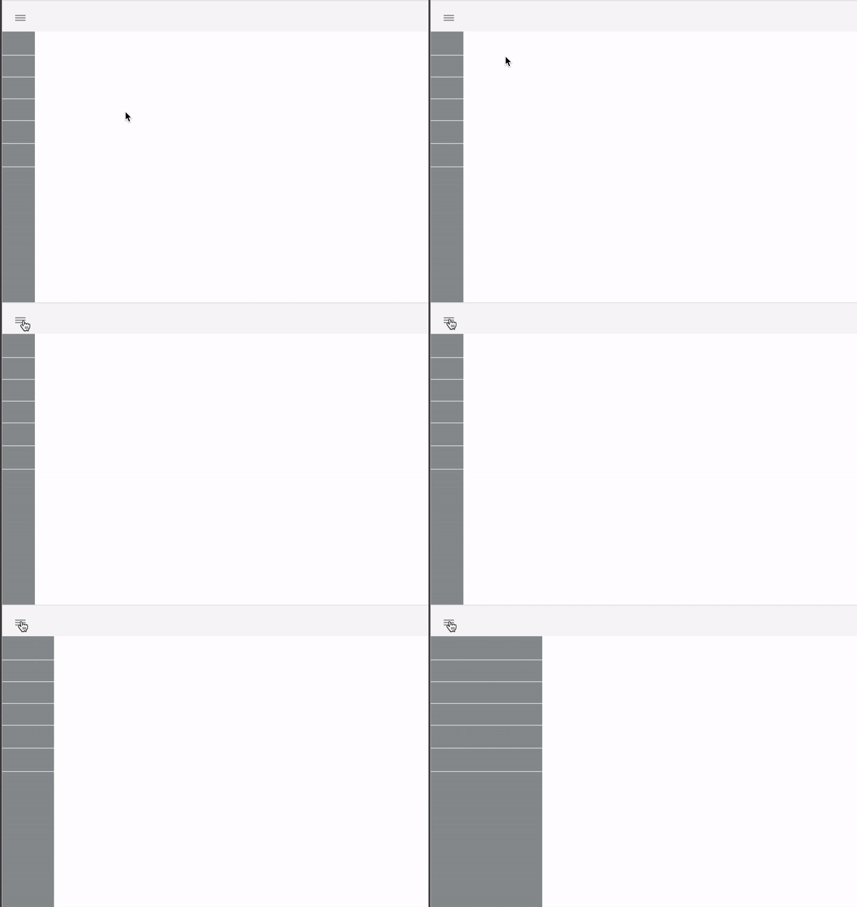
A solution to the clutter on the platform, was to create an accordion style menu. I presented this mock up example to the development team to see if it was possible. It was important to organize the design elements in a dynamic structure. Based on the problems identified, I worked towards designing to some solve the potential problems:

Usability Testing
I conducted a usability testing sessions with some of the users (both managers & employees) to validate whether the new designs would solve their problems. I made notes including a scenario if users had to ask for overtime. During the session, I observed how they interacted with the prototype and see if they were engaged.
-
Managers mode switching to input their timecard as well.
-
Searching the menu was confusing based on the tab.
-
Participants knew the platform existed but some didn't, they rather stay with the paper format in delivering.
-
Some participants didn't know if their timecard were submitted.
Iteration for improvements
After testing with real users, I adjusted design elements and the information hierarchy based on users’ decision-making process. I made small changes and added some element that wouldn't break the hierarchy of the platform.


Creating the Design System
After some time working on the product, I decided to build the design system. It would help me to communicate, ease the process of producing features and uniformise all the assets in the product. We mostly needed a place where we could put all the knowledge and thinking when we were working on new features.
